Friday, January 28, 2011

initial leap

A designer’s purpose may be to educate, connect, provoke, author, facilitate. (as gleaned from advisor, Jamie Gray) Honestly, these action words will assist will keeping my project from becoming self-fulfilling mush.

Intervention
My position as a designer, is to identify a problem and intervene with a graphic design solution. Within this structure, My research experiments will consist of tests to will help narrow the topic of portrait and narrative toward a valid and concise focus.

(If I were to join the El Dorado teams my personal question may begin as: how can photographic narrative asssist with the facilitation of two separate communities?)

tests
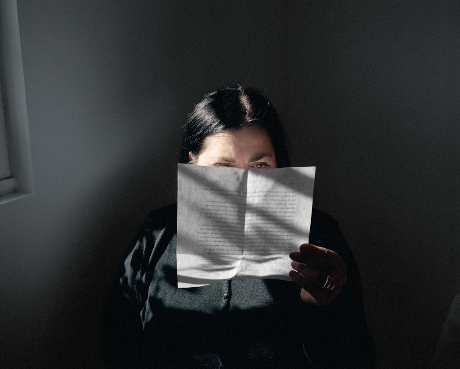
A test will include aquiring models and photographing them (with added graphic design elements) to expand the traditional photograph to contain more layers of meaning and information. I would like the photographs to speak loudly and drip with narrative.

I will refer to those whom I look up to as portrait masters to keep my work in check:
Felix Gonzales-Torres, Portrait of Ross

Sophie Calle, Self Portrait
Sophie Calle, The Love Letter
Lois GreenField
Lois GreenField
Cindy Sherman, Untitled Film Still
Annie Leibovitz
Mapplethorpe, William BurroughsMapplethorpe, Self Portrait

Soul Search

Project Proposal
I entered art school with a longing to photograph truth; Initially I aspired to pursue, cut and dry, photojournalism. And then I happened upon photographers such as Nan Golden who understood photography as an opportunity to reveal portraits of the less palatable side of truth—a photojournalistic biography of the underbelly and the so-called freaks. Another inspiration is Sophie Calle, who includes photography and typography within her autobiographical (though often fictitious) story-telling accounts. Cindy Sherman has also emerged as a source of inspiration, especially her invented identities and egos within the series titled, Untitled Film Stills. I have come to the conclusion, photography carries much broader potential for narrative injections.

My need for this project is to pursue my deep unquenchable passions. Photography is a defining force for me; I feel most at ease when behind a camera, (not to mention in front of the camera.) And I now consider the marriage of graphic design with photography and opportunity to dive into the world of fine art.

I am longing to position my project around the portrait. The reasons for this are many; I am captivated by the soul penetrating portraiture of such artists as Man Ray, Annie Leibovitz, Robert Mapplethorpe, Felix Gonzales-Torres, as well as the autobiographical and ego/alter ego exploration others such as of Cindy Sherman, Sophie Calle, Nan Golden, Pipilotti Rist…. After being exposed to rhetoric possibilities, I feel like a secret weapon ready to am and fire at photographic narrative pursuits.

Social Objectives
For my social objective, I would like to encourage others to reconsider the idea surrounding the portrait as a possibility to to flavor with narrative and layers of meaning. Truth is not always the goal. The addition of graphic design elements will serve to complement as well as contradict narrative. In my opinion, the existing view of the portrait is occasionally a simple and carelessly rendered smile and cheese, in and out experience. I am thirsting for more.

Messages
My primary message would be to communicate that the incorporation of graphic design to a portrait can elevate the narrative. I long to expand and contradict the real or perceived “truth” surrounding the image.

Audience
My “concerned” audience would include art enthusiasts and those that frequent the art show scene, as a longing for this project would be a gallery show.

Communication Strategies
For this project to function, I will require interesting personalities—models. I will employ experimental methods of graphic design that include topics of rhetoric to expand the idea surrounding the portrait.

Competitive Landscape
The competitive landscape includes high profile photographers and artists that will serve as both inspiration as well as a leaping point to test and combine possible methods.

Tuesday, January 25, 2011

rhizome expansion

A sifting process is continually occurring with my career goals. For instance, my initial life goal was to become a photojournalist. Upon entering the photo department at the Kansas City Art Institute, a veil was lifted to the world of fine art photography. I gulped at the possibilities. My interest in methods of image making and typography led to a spirited, deer leap to the Graphic Design department. Choosing to tread this terrain has exposed endless options for my design; type and image combinations now carry toxic potential. And most recently, my love interest has broadened to include combining narrative with motion. I have a strong feeling, the filmmaking class I am engaged in this semester, will lead to yet another complementary rhizome expansion. (And did I mention how much I love to write?)

And so…for my career goals, I am deeply enamored with the performing arts. My freelance work assures this, as well as a recent design internship with a dance company. In addition to unearthing fragrant advertising possibilities, my desire is to assist with the application of design to performance—the latter, a new mark of pursuit.

The final answer to my purpose in life is, an optimistic…to be continued.

Monday, January 24, 2011

check out the folly site!

The thumbnail and expanded view images for the folly site were applied below. (Go hot pink.)

Friday, January 21, 2011

Thursday, January 20, 2011

alter ego ethos

a new website possibility...my excessively confident alter ego exists in many (if not all) of my self portraits.

Tuesday, January 11, 2011

the pick

Classy, Modern, Hot Pink (the essence)
32 x 48" poster:
lettersize poster:
postcard:
the program cover:

Friday, December 31, 2010

more calisthenics

I am pretending the budget is the moon and proposing a series...

cartwheel

I am not quite sure how I feel about this one. (Too teen pop singer?) hmmm. The curly brackets need to calm down a little. At any rate, this dada type-image interaction has potential...

Thursday, December 30, 2010

backbends

Flexibility test. (Praise the good lord for Tristan Tzara.) The word night is supposed to feel like a shadow within modern. (A recurring accusation seems to be my supreme ability to create cryptic messages. I don't mind—but until my name is Venezky, I will have to posture myself with slight concern.)

Sadly this design would have been much better if my printer was working—so I could give scissors to my neglected analog innerchild.

Wednesday, December 29, 2010

push-ups & sit-ups

Just cracking knuckles and such. Loose (not yet April-worthy) comps for the love of process, right? Oh and hello high modernism, oh how I adore you.

Is it possible to describe, A Modern Night at the Folly without a dancer?
(Man that 8pm does look horsey. Could I create something a little more happy and limber?—contrary to popular belief, hot pink does not always sift away the stiffness of a design.)

Wednesday, November 17, 2010

project m

adam johnson is a kind person

Adam Johnson, an artist currently studying at Pacific Northwest College of Art, has granted permission to apply his soundtrack to our sidewalk advocacy video.

He sent me a link to his vimeo site as well; I would like to share the beauty...In my opinion, Adam Johnson possesses the dangerous ability to transform everyday moments into breathtaking experiences.

Monday, November 15, 2010

where the sidewalk ends

where the sidewalk ends from tammy shell on Vimeo.

tom, amanda and I joined forces to spread the need for sidewalks and crosswalks in Rosedale—specifically with a goal to give kids safe passage to the park.

Thursday, November 4, 2010

flight school 2


I always have to begin outside of the computer with real materials, before I enter into the computer, unless my objective is a super stiff design.

design decisions: As a whole, the goal is pathos—to invite the viewer to experience aerial acrobatics, all in a quick glance.

The ribbon type contains the indexical information of the silks. I avoided revealing the face of the dancer; the viewer can now impose his or hers in place. The type is cropped to add the larger than life feeling—and of course to reference the high modernist dance posters of the glorious past.

Monday, November 1, 2010

learning curve

hey, that's my shoe.

revised and more dirt laden

The goal of this visual identity will be to convey the idea that vegan food can be surprisingly and explosively tasty. The tone of voice will be caring and optimistic. The attributes to be embodied will be friendly, organic and eclectic chic. The needs fulfilled will be healthy and flavorful food located in an inviting and non judgmental community.

other side
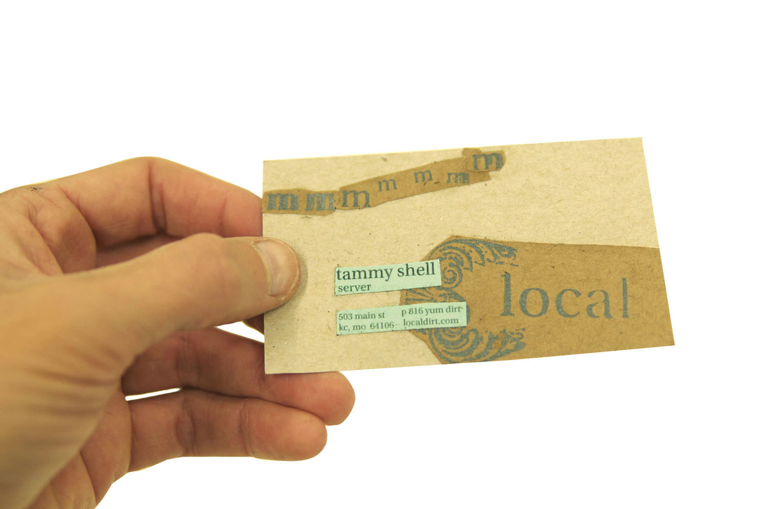
business card
website mainpageinvoice frontinvoice back (the pad with make ready and screen printed collage, hammerpress + tammypress)We never said we were dirt cheap.the menu cover (made from old book cover elements + screen printed collage elements)

(my inner cameron perry may have taken over for this one)
Stationary will be an item for sale in the restaurant. The front at back covers will be printed on make ready stock whenever possible. This would likely be a handmade item as this company cherishes thoughtfulness and detail.
never crop a hand like this
outrageously colorful billboard (a little too much)our errand running vehiclethe #10 envelope; notice eat would be revealed only after removing the mailed item.tshirts! (way too clean, it is true)