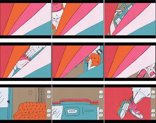
Monday, November 30, 2009

cheerleaders are terrible and generally horrible people

resume text possibilities (alternate title to my original Lari Pittmann-influenced title)

Cherishing Process
Similar to the rewards for slowly steeping tea to fully experience its aroma and flavor, my years as a production artist have affirmed a love for severe detail and process. I savor the incubation period surrounding a design project and the teeny-tiny specs longing–squawking–to be infused with clarity and meaning.

Elevating Collaboration
Not unlike a fever, I relish and devour the concept of art supporting art; it’s a little selfish, but I regularly pursue design projects with various musicians, dance and theater groups I am enamored with.

A Note on Character
I was raised in a Southern Baptist home and have officially been saved a gazillion times; in spite of my determined apathy...I still believe.

Cheerleaders are Terrible and Generally Horrible People
Photography is a way of life for me. Luckily, I did not make the cheerleading squad my freshman year of highschool; joining the newspaper staff ignited the fuse to this first love that informs my design as well as assures my purpose for a pulse.

Monday, November 16, 2009

a skeleton

from flash

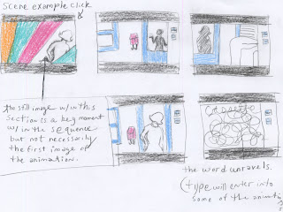
I have begun placing images in flash... sean thought some of my transitions could be simpler. At times when the image is animated and the type is moving, it's a little overwhelming. Richard suggested choosing a way to introduce text and sticking to it. i thought adding a variety of transitions would be more interesting. Also something richard said may change my flash life forever; he suggests creating a new scene, with each chunk. i feel that if i remain in flash, i will continue to have a very slow production rate. I've considered switching formats to a little black book (to allude to the intimate phone conversation).

Friday, November 13, 2009

communication model revisions


the model at the lower right has received the most votes for visually engaging. Carly suggested adding a strip of noise to the feedback area as well. The infograph on the top left also received a vote for clarity; I suspect it was the application of transparency. I initially thought the top left graph was a clear direction, but now I am afraid I am assulting the viewer with too many ridiculous shapes.
I decided to give up on altering the avocado phone and i found two more phones. One brown (the masculine one) and one seafoam green (oh so feminine). Hmmmm. i feel like color is such a vital component within my animation and so... once again, i have decided nothing is quite as lovely as the magenta/red phone combo. photoshop i shall.


show opener

I would create a show about average people who happen to have a secret. they dance in their living rooms. this opener would describe a documentary style show of traveling across the country and discovering a common expresssion of dancing feet; many of these fantasy dancers are possibly extremely talented (or think they are) or too shy to step into a dance club.

The audience would like likely be a twenty something or early thirties group. I am not excluding any specific demographic on purpose, just guessing elderly people would not feel quite as drawn to the show.

The television channel would contain many documentary style programs. Reality shows and the like. I am thinking about just showing feet performing dance moves. 
--------
an inspiring way to video tape dancing:
http://www.youtube.com/watch?v=FTOGa4S0A6Q

(an inspiration for closet dancers)
so you think you can dance: http://www.youtube.com/watch?v=l8Ir9HmOzi8

dancing with the stars: http://www.slashcontrol.com/free-tv-shows/dancing-with-the-stars/2302102243-results-show-week-8

Monday, November 9, 2009

statement for non-linear project

The addition of music, voice and sound-effects significantly guides the meaning of a communication channel that is solely visual. For instance, my interactive piece begins with only a macro view of five cassette player buttons. I tried to pick a variety of sounds that would foreshadow drama within the animation (contained in the play button). The sound buttons consist of dance move instructions, a song titled, I Won't Dance, crickets chirping and a crash sound effect; I have tried to add to the connotations of a cassette player as a possible channel for music, dancing, tragedy and embarrassment.

Music, voice and sound can communicate a story within a story.
Music without lyrics can evoke a mood, for instance, the dance music in my intro—after pressing the play button—adds a mood of excitement. Adding voice can add confusion or clarity for listener, depending on whether or not the lyrics make sense. For instance, the voice within my second scene, states, "the following program is an exercise in living in the moment," while the image is me about to press a play button. A severely literal person may not understand the connection of a girl who is about to dance her pants off to self-help audio. And lastly, even a simple sound effect can tell a story. One of the abstract sound effects within my forth scene is an alarm that occurs when a person appears at the door to discover me dancing; through a sound bite I have communicated, danger, bad, fear, hurry, make it stop.

Simultaneous and sequential communication
Simultaneous communication can alter the meaning of a sound or visual. For instance, in my initial cassette button scene, if the viewer clicked the button containing dance instructions, he or she might gather that this piece is about learning to dance. But when the instructions are layered with other buttons such as a crashing sound-effect and song titled, I Won't Dance, the meaning alters from stiff instructions to a nervous dance scene.

User vs designer control
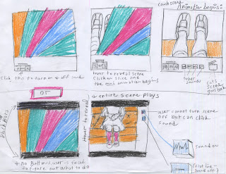
Within my first scene, the user has control of turning sounds on/off /layering or playing a video. (The sounds have to be discovered and are not labeled, but rather a color flashes when a button rollover occurs.) If the user hits the play button, he or she is rendered helpless under my control to watch short scene teaser animation. When the animation ends, the user is once again in the driver's seat to turn any of five scenes on or off. Although the user is free to pick any of the five animation sequences and play them in any order, I've decided to establish designer control by embedding sound within the videos.

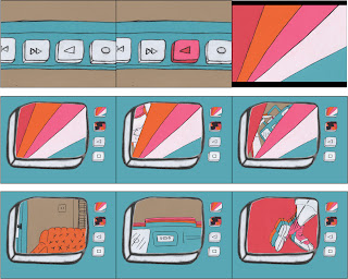
The initial frame of my interactive piece contains four sounds and a video launch button:
Upon pressing the big, pink play button, an intro animation occurs and takes the user to this
sequence picker mainframe (pick any sequence of five):
after a sequence is chosen, an animation plays (with sound embedded) and the eject button to the right takes the user back to the
sequence picker mainframe:

To clarify the conversation

I have decided to clarify the modes within my animation at the very beginning. (since the annotation text appears to be getting a little heavy in the conversation) I will create an iteration with my diagram coming together with highlights of each component. 

miss communication


makeover:
first of all, I found a nice avocado rotary dial phone at the antique mall. I took a few photos and transformed the nasty green into the two participants in my phone conversation, magenta for sally and red for edward. The makeover took much, much, much longer than I thought it would.

dodging punches:
Next I noticed the original angle of my internet found phone photo, low, eye-level and much more intimate. I felt like I could not yet begin my story without re-photographing the new phone. I have resolved to take a few eye-level photos of my phone.

the original internet-found photo with a more coveted and intimate angle:
And so, I began writing annotations instead.

Friday, November 6, 2009

Thursday, November 5, 2009

Wednesday, November 4, 2009

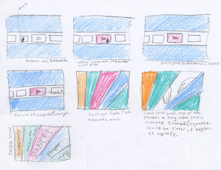
website storyboards

initial sketches: basic layout:
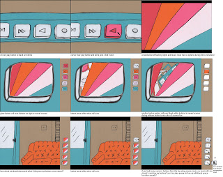
After successfully finding the magic pink play button within the initial screen, the user will roll over music strips to reveal a key scene still. Upon clicking the key scene still, the movie plays. I am hoping to have some sound embedded within the animation as well at least one additional sound effects button.
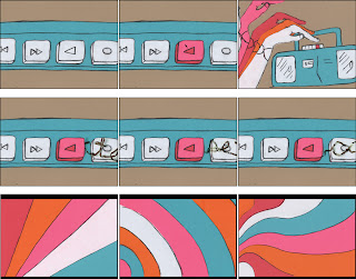
Below is an example of my initial idea to apply the image of a cassette player to a sound button. Press once to turn sound on twice to turn it off. In order to exit the chosen animation and go back to the main page—of music strips—to pick a new scene click the scene cut icon. I believe I may substitute a scull and cross bones or an eject button for this go back function.digital renderings: Initial scene to find the pink button has a reward upon clicking; the word cassette is revealed and music plays. Since this web page format is not directly proportional to our previous animation, I chose to crop or add to (rubber stamp the area) the images in some scenes and others, I've added black back or add bars to the top or bottom of the frame. The black bars allow for a nice reference to an actual movie playing within a specific format.
Below is my pick, so far, for the most cohesive button integration. The small buttons seem clean on the kraft background and would allow the animations the proper amount of attention.
Below is a second visual option: after the pink button has been clicked and the music plays with flashing colors, a giant cassette player button is the new main frame. Buttons on the right of the newly swollen blue cassette player allow the scenes to be revealed. See all my button possibilities below.for this simpler version: I decided to minimize the buttons to the bare necessities. and keep the scene animations within the giant button. The giant button frame may be too redundant and silly.

Monday, November 2, 2009

almost a pretty good cover design

Russel Wright was a fan of function. For a possible cover design, I considered a highly functional item: a chair. Considering how the type is placed (in some areas), the chair also serves as an invitation to the passerby to sit down and read this book.

cover options viewed as spreads:

covers viewed as (would be) folded:
Creating a design with the spread in mind is a good idea; another good idea is to consider how the design will be disrupted by the fold. For instance, my placement of a chair in the center area with type pleasantly stacked above and below (see top spread) was the worst idea on earth. Upon folding the book I realized the tip of the chair does not give enough information to the viewer.

Good Design is for Everyone, take two

I decided to tighten up the center margin—within the spread—and add more breathing space within my design. Negative space can add sophistication, but in some of these spreads, I may have gone too far. Also I played with the flow line to create a more appealing design; on some pages the flow line is obvious, on others, it's less apparent.


Good Design is for Everyone, from the beginning

My initial spread inspiration a Max Bill design from the 1940s book, Die Neue Architektur (found in Lupton's Thinking with Type):And so my first proposed grid structure was the following: Russel Wright transformed himself from urban trendsetter to suburban guru, and ultimately rural nonconformist; this quote from the essay, From Hollywood to Walden Pond, encouraged a new direction to my design. The following amazingly beautiful spread found in Thinking with Type, gave me additional inspiration:The following are the first attempts in the new direction: I discovered during the first group critique, my center margin was too wide and distracting from the viewer's ability to view the spread as a complete unit.