a demonstration of mis communication from tammy shell on Vimeo.
Wednesday, December 9, 2009
Monday, December 7, 2009
analysis and synthesis
My text within the animation demonstrates three distinct voices; the red-serifed (Caslon) text illustrates the conversation between the phones (as well as contains the story, for the visually compelling element). The italicized Garamond font illustrates the subjective narration (also a reference to the postcards) and the san-serifed Frutiger demonstrates the informative text to describe the communication model.
 Above : first attempts at establishing hierarchy. In the top right example, the blue text was making people ill. In the top left example my vertical text was too difficult to read. For clarity, Jamie suggested adding a bar at the top to contain the voice of the narrator.
Below on the left, is another example of the formerly floundering narrator’s text, not to mention the terribly lack-luster background. I added a paper texture to the background and hand cut annotations to isolate the information as significant and to give the design a human touch. Text printed on paper seems to carry more authority, in comparison to the vector type of previous iterations.
 below: a screenshots from the final animation.
 synthesis in fragments. Applying the semiotic examples of rhetorical tropes and modes of communication are keys (and well kept secrets) to good graphic design—and any type of art for that matter. Indirectly persuading the viewer with clever imagery is more resonating than an intelligence-insulting, dry and literal claim. I've wondered in the past what it is that separates the banal from art that moves people to action. Well now I know why the lovely peregrine honig, nicole cawlfield, pipilotti rist, de bretteville and others i worship and adore from afar are able to captivate and immobilize a passerby to pause and consider core beliefs.
 Above : first attempts at establishing hierarchy. In the top right example, the blue text was making people ill. In the top left example my vertical text was too difficult to read. For clarity, Jamie suggested adding a bar at the top to contain the voice of the narrator.
Below on the left, is another example of the formerly floundering narrator’s text, not to mention the terribly lack-luster background. I added a paper texture to the background and hand cut annotations to isolate the information as significant and to give the design a human touch. Text printed on paper seems to carry more authority, in comparison to the vector type of previous iterations.
 below: a screenshots from the final animation.
 synthesis in fragments. Applying the semiotic examples of rhetorical tropes and modes of communication are keys (and well kept secrets) to good graphic design—and any type of art for that matter. Indirectly persuading the viewer with clever imagery is more resonating than an intelligence-insulting, dry and literal claim. I've wondered in the past what it is that separates the banal from art that moves people to action. Well now I know why the lovely peregrine honig, nicole cawlfield, pipilotti rist, de bretteville and others i worship and adore from afar are able to captivate and immobilize a passerby to pause and consider core beliefs.
 After comparing and analyzing several communication models, I now realize that even a simple message is not immune to becoming corrupt. (considering the previous project) Conner’s initial response to my postcard was, silence. In the first sequence of my personified phones’ conversation, I decided to reference the chill of silence. Under my interpretation of the communication model, silence is packed with explosive noise—or an interruption to the message. For a short while, I was left to consider how I must have confused Conner and what if he thought my original response was not worthy of a reply. A dreadful cloud of prediction and misunderstanding hovers during silence. It was likely that he just happened to go out dancing the night before could not get up in time or maybe he ate mexican the night before, you never know.
(Communication models are also a free counseling service. I have learned that maybe my mother will in fact never get me due to her conservative bend and I may never get her due to my bad attitude. Our diametrically opposed beliefs cause noise within our channel. To reduce the consequences of reflexive, ill-tempered feedback, a more successful channel for the two of us, would be a hand-written letter.)
Friday, December 4, 2009
statement for show opener
My show is about performance—of the mostly unpaid variety, the type of performance that might happen on the fly, while under the spell of a moment. Moments that most people would contain in their mind and shrug off with a chuckle, my show is about free spirits who must live life in the now to its fullest capacity.
 I began with photographs of myself dancing. (Vanity disclaimer: Alter egos are a driving force in my life. Either film or video, I am able to will myself to do almost anything. I have found that photo directing other people takes as much skill and supreme commitment on their part as imagining the shot, in the first place.) My initial plan was to create a stop motion about a closet dancer—someone who is too shy to dance in public, but becomes a superstar behind closed doors. Then plan B went into effect. Over thanksgiving, my epiphany was to commit, random acts of dancing in public, and so I recruited a friend. The theme broadened to performance art.
 above are shots of process: the fabricated stage and my cut out placed in it. I thought hand-written title text was appropriate to the unspoken anyone can be an artist of performance theme, but no, it failed; too sloppy, I agree.
the original storyboard below: (although during the creative process, plan b went into effect) The communication channels, I chose to apply to my show opener are image (video and still), music and text. The hierarchy is as follows: video absolutely drives this opener. Narrowing down the information to essentials from three separate performance scenes was difficult. The thirty-second time limit was both suffocating and helpful. I wanted to put in everything, but I have learned, a story becomes weak when too much repetitive information is given.
 I began with photographs of myself dancing. (Vanity disclaimer: Alter egos are a driving force in my life. Either film or video, I am able to will myself to do almost anything. I have found that photo directing other people takes as much skill and supreme commitment on their part as imagining the shot, in the first place.) My initial plan was to create a stop motion about a closet dancer—someone who is too shy to dance in public, but becomes a superstar behind closed doors. Then plan B went into effect. Over thanksgiving, my epiphany was to commit, random acts of dancing in public, and so I recruited a friend. The theme broadened to performance art.
 above are shots of process: the fabricated stage and my cut out placed in it. I thought hand-written title text was appropriate to the unspoken anyone can be an artist of performance theme, but no, it failed; too sloppy, I agree.
the original storyboard below: (although during the creative process, plan b went into effect)
 The communication channels, I chose to apply to my show opener are image (video and still), music and text. The hierarchy is as follows: video absolutely drives this opener. Narrowing down the information to essentials from three separate performance scenes was difficult. The thirty-second time limit was both suffocating and helpful. I wanted to put in everything, but I have learned, a story becomes weak when too much repetitive information is given.
The music is strangely melancholy; a better description would be thoughtful. I wanted to avoid at all costs a mindless, superficial electronic dance beat. In some and maybe most cases, performance is something that originates within the fragile spirit and evolves into an expression previously possessed by the deep recesses—slightly melodramatic, but true. It’s fun and freeing, but absolutely not a superficial experience; that’s all I wanted to convey.
I chose to fabricate a stage with paper, drawings and fabric since the stage before me is only imaginary. My influence was the Science of Sleep sequences when the character, Stephane flashes back and forth, in and out of reality. To contain the text in a resonating manner, I placed it within the rays of colorful spot lights. My stop motion “me in a red dress” shots in the fabricated stage background are powerful and could have overtaken the hierarchy, but my need to allow the video to include intro shots to establish the scene (i.e. me walking into the laundromat) and crooked stares from each of my victims, reduced the space available.
performance art (of the mostly unpaid variety) from tammy shell on Vimeo.
Monday, November 30, 2009
cheerleaders are terrible and generally horrible people
resume text possibilities (alternate title to my original Lari Pittmann-influenced title)
Cherishing Process
Similar to the rewards for slowly steeping tea to fully experience its aroma and flavor, my years as a production artist have affirmed a love for severe detail and process. I savor the incubation period surrounding a design project and the teeny-tiny specs longing–squawking–to be infused with clarity and meaning.
Elevating Collaboration
Not unlike a fever, I relish and devour the concept of art supporting art; it’s a little selfish, but I regularly pursue design projects with various musicians, dance and theater groups I am enamored with.
A Note on Character
I was raised in a Southern Baptist home and have officially been saved a gazillion times; in spite of my determined apathy...I still believe.
Cheerleaders are Terrible and Generally Horrible People
Photography is a way of life for me. Luckily, I did not make the cheerleading squad my freshman year of highschool; joining the newspaper staff ignited the fuse to this first love that informs my design as well as assures my purpose for a pulse.
Monday, November 16, 2009
from flash
 I have begun placing images in flash... sean thought some of my transitions could be simpler. At times when the image is animated and the type is moving, it's a little overwhelming. Richard suggested choosing a way to introduce text and sticking to it. i thought adding a variety of transitions would be more interesting. Also something richard said may change my flash life forever; he suggests creating a new scene, with each chunk. i feel that if i remain in flash, i will continue to have a very slow production rate. I've considered switching formats to a little black book (to allude to the intimate phone conversation).
Friday, November 13, 2009
communication model revisions

the model at the lower right has received the most votes for visually engaging. Carly suggested adding a strip of noise to the feedback area as well. The infograph on the top left also received a vote for clarity; I suspect it was the application of transparency. I initially thought the top left graph was a clear direction, but now I am afraid I am assulting the viewer with too many ridiculous shapes.
I decided to give up on altering the avocado phone and i found two more phones. One brown (the masculine one) and one seafoam green (oh so feminine). Hmmmm. i feel like color is such a vital component within my animation and so... once again, i have decided nothing is quite as lovely as the magenta/red phone combo. photoshop i shall.


show opener
I would create a show about average people who happen to have a secret. they dance in their living rooms. this opener would describe a documentary style show of traveling across the country and discovering a common expresssion of dancing feet; many of these fantasy dancers are possibly extremely talented (or think they are) or too shy to step into a dance club.
The audience would like likely be a twenty something or early thirties group. I am not excluding any specific demographic on purpose, just guessing elderly people would not feel quite as drawn to the show.
The television channel would contain many documentary style programs. Reality shows and the like. I am thinking about just showing feet performing dance moves.
--------
--------
an inspiring way to video tape dancing:
http://www.youtube.com/watch?v=FTOGa4S0A6Q
(an inspiration for closet dancers)
so you think you can dance: http://www.youtube.com/watch?v=l8Ir9HmOzi8
dancing with the stars: http://www.slashcontrol.com/free-tv-shows/dancing-with-the-stars/2302102243-results-show-week-8
http://www.youtube.com/watch?v=FTOGa4S0A6Q
(an inspiration for closet dancers)
so you think you can dance: http://www.youtube.com/watch?v=l8Ir9HmOzi8
dancing with the stars: http://www.slashcontrol.com/free-tv-shows/dancing-with-the-stars/2302102243-results-show-week-8
Monday, November 9, 2009
statement for non-linear project
The addition of music, voice and sound-effects significantly guides the meaning of a communication channel that is solely visual. For instance, my interactive piece begins with only a macro view of five cassette player buttons. I tried to pick a variety of sounds that would foreshadow drama within the animation (contained in the play button). The sound buttons consist of dance move instructions, a song titled, I Won't Dance, crickets chirping and a crash sound effect; I have tried to add to the connotations of a cassette player as a possible channel for music, dancing, tragedy and embarrassment.
Music, voice and sound can communicate a story within a story.
Music without lyrics can evoke a mood, for instance, the dance music in my intro—after pressing the play button—adds a mood of excitement. Adding voice can add confusion or clarity for listener, depending on whether or not the lyrics make sense. For instance, the voice within my second scene, states, "the following program is an exercise in living in the moment," while the image is me about to press a play button. A severely literal person may not understand the connection of a girl who is about to dance her pants off to self-help audio. And lastly, even a simple sound effect can tell a story. One of the abstract sound effects within my forth scene is an alarm that occurs when a person appears at the door to discover me dancing; through a sound bite I have communicated, danger, bad, fear, hurry, make it stop.
Simultaneous and sequential communication
Simultaneous communication can alter the meaning of a sound or visual. For instance, in my initial cassette button scene, if the viewer clicked the button containing dance instructions, he or she might gather that this piece is about learning to dance. But when the instructions are layered with other buttons such as a crashing sound-effect and song titled, I Won't Dance, the meaning alters from stiff instructions to a nervous dance scene.
User vs designer control
Within my first scene, the user has control of turning sounds on/off /layering or playing a video. (The sounds have to be discovered and are not labeled, but rather a color flashes when a button rollover occurs.) If the user hits the play button, he or she is rendered helpless under my control to watch short scene teaser animation. When the animation ends, the user is once again in the driver's seat to turn any of five scenes on or off. Although the user is free to pick any of the five animation sequences and play them in any order, I've decided to establish designer control by embedding sound within the videos.
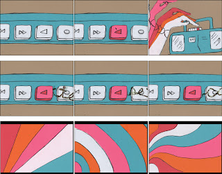
The initial frame of my interactive piece contains four sounds and a video launch button:
 Upon pressing the big, pink play button, an intro animation occurs and takes the user to this sequence picker mainframe (pick any sequence of five):
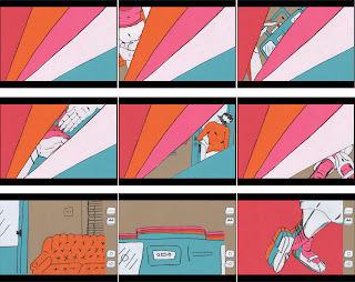
 after a sequence is chosen, an animation plays (with sound embedded) and the eject button to the right takes the user back to the sequence picker mainframe:

The initial frame of my interactive piece contains four sounds and a video launch button:
 Upon pressing the big, pink play button, an intro animation occurs and takes the user to this sequence picker mainframe (pick any sequence of five):
 after a sequence is chosen, an animation plays (with sound embedded) and the eject button to the right takes the user back to the sequence picker mainframe:
To clarify the conversation
miss communication


makeover:
first of all, I found a nice avocado rotary dial phone at the antique mall. I took a few photos and transformed the nasty green into the two participants in my phone conversation, magenta for sally and red for edward. The makeover took much, much, much longer than I thought it would.
dodging punches:
Next I noticed the original angle of my internet found phone photo, low, eye-level and much more intimate. I felt like I could not yet begin my story without re-photographing the new phone. I have resolved to take a few eye-level photos of my phone.

 the original internet-found photo with a more coveted and intimate angle:
 And so, I began writing annotations instead.
Friday, November 6, 2009
Thursday, November 5, 2009
Wednesday, November 4, 2009
website storyboards
initial sketches: basic layout:
After successfully finding the magic pink play button within the initial screen, the user will roll over music strips to reveal a key scene still. Upon clicking the key scene still, the movie plays. I am hoping to have some sound embedded within the animation as well at least one additional sound effects button.
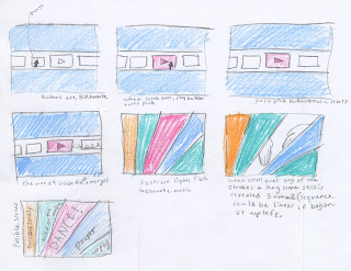 Below is an example of my initial idea to apply the image of a cassette player to a sound button. Press once to turn sound on twice to turn it off. In order to exit the chosen animation and go back to the main page—of music strips—to pick a new scene click the scene cut icon. I believe I may substitute a scull and cross bones or an eject button for this go back function.
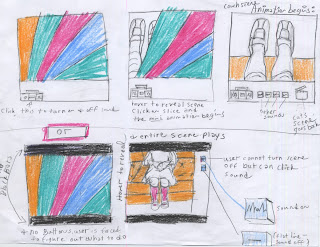
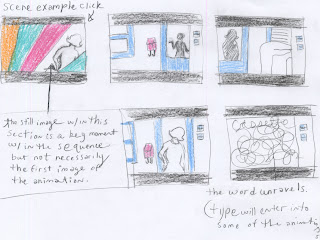 digital renderings: Initial scene to find the pink button has a reward upon clicking; the word cassette is revealed and music plays. Since this web page format is not directly proportional to our previous animation, I chose to crop or add to (rubber stamp the area) the images in some scenes and others, I've added black back or add bars to the top or bottom of the frame. The black bars allow for a nice reference to an actual movie playing within a specific format.
 Below is my pick, so far, for the most cohesive button integration. The small buttons seem clean on the kraft background and would allow the animations the proper amount of attention.
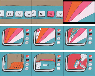
 Below is a second visual option: after the pink button has been clicked and the music plays with flashing colors, a giant cassette player button is the new main frame. Buttons on the right of the newly swollen blue cassette player allow the scenes to be revealed. See all my button possibilities below.
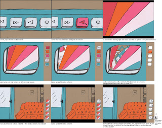 for this simpler version: I decided to minimize the buttons to the bare necessities. and keep the scene animations within the giant button. The giant button frame may be too redundant and silly.
After successfully finding the magic pink play button within the initial screen, the user will roll over music strips to reveal a key scene still. Upon clicking the key scene still, the movie plays. I am hoping to have some sound embedded within the animation as well at least one additional sound effects button.
 Below is an example of my initial idea to apply the image of a cassette player to a sound button. Press once to turn sound on twice to turn it off. In order to exit the chosen animation and go back to the main page—of music strips—to pick a new scene click the scene cut icon. I believe I may substitute a scull and cross bones or an eject button for this go back function.
 digital renderings: Initial scene to find the pink button has a reward upon clicking; the word cassette is revealed and music plays. Since this web page format is not directly proportional to our previous animation, I chose to crop or add to (rubber stamp the area) the images in some scenes and others, I've added black back or add bars to the top or bottom of the frame. The black bars allow for a nice reference to an actual movie playing within a specific format.
 Below is my pick, so far, for the most cohesive button integration. The small buttons seem clean on the kraft background and would allow the animations the proper amount of attention.
 Below is a second visual option: after the pink button has been clicked and the music plays with flashing colors, a giant cassette player button is the new main frame. Buttons on the right of the newly swollen blue cassette player allow the scenes to be revealed. See all my button possibilities below.
 for this simpler version: I decided to minimize the buttons to the bare necessities. and keep the scene animations within the giant button. The giant button frame may be too redundant and silly.
Monday, November 2, 2009
almost a pretty good cover design
Russel Wright was a fan of function. For a possible cover design, I considered a highly functional item: a chair. Considering how the type is placed (in some areas), the chair also serves as an invitation to the passerby to sit down and read this book.
cover options viewed as spreads:
 covers viewed as (would be) folded:
 Creating a design with the spread in mind is a good idea; another good idea is to consider how the design will be disrupted by the fold. For instance, my placement of a chair in the center area with type pleasantly stacked above and below (see top spread) was the worst idea on earth. Upon folding the book I realized the tip of the chair does not give enough information to the viewer.
cover options viewed as spreads:
 covers viewed as (would be) folded:
 Creating a design with the spread in mind is a good idea; another good idea is to consider how the design will be disrupted by the fold. For instance, my placement of a chair in the center area with type pleasantly stacked above and below (see top spread) was the worst idea on earth. Upon folding the book I realized the tip of the chair does not give enough information to the viewer.
Good Design is for Everyone, take two
I decided to tighten up the center margin—within the spread—and add more breathing space within my design. Negative space can add sophistication, but in some of these spreads, I may have gone too far. Also I played with the flow line to create a more appealing design; on some pages the flow line is obvious, on others, it's less apparent.


Good Design is for Everyone, from the beginning
My initial spread inspiration a Max Bill design from the 1940s book, Die Neue Architektur (found in Lupton's Thinking with Type): And so my first proposed grid structure was the following:
  Russel Wright transformed himself from urban trendsetter to suburban guru, and ultimately rural nonconformist; this quote from the essay, From Hollywood to Walden Pond, encouraged a new direction to my design. The following amazingly beautiful spread found in Thinking with Type, gave me additional inspiration:
 The following are the first attempts in the new direction: I discovered during the first group critique, my center margin was too wide and distracting from the viewer's ability to view the spread as a complete unit.
 And so my first proposed grid structure was the following:
  Russel Wright transformed himself from urban trendsetter to suburban guru, and ultimately rural nonconformist; this quote from the essay, From Hollywood to Walden Pond, encouraged a new direction to my design. The following amazingly beautiful spread found in Thinking with Type, gave me additional inspiration:
 The following are the first attempts in the new direction: I discovered during the first group critique, my center margin was too wide and distracting from the viewer's ability to view the spread as a complete unit.
Friday, October 30, 2009
Thursday, October 29, 2009
danza macabra

(and so, a friend who is quite possibly responsible for me being in graphic design, based on my initial pursuit years ago to design posters for a few of her musical ambitions) mikal shapiro is putting on yet another amazing shadow play... see interview below by timothy finn, music critic of the kansas city star
and well, how about an amazing youtube video of mikal practicing/playing music that she will kill me for putting on my blog.
Tuesday, October 27, 2009
Subscribe to:
Comments (Atom)


