Tuesday, August 31, 2010

beyond backyard gardening


The focus of this model is relationships
As the individual along with his or her history and life goals interact and intertwine with the structure and agency within the site, relationships emerge. The newly blossomed relationships potentially result in a more powerful impact on society, especially with community gardening as the focus.

The ability to control or make decisions within the community will be guided organically by the participants. Those who are active and post or upload often will naturally and likely carry the most influence within the community.

All are necessary contributors. Some participants may be more focused on gardening as a hobby while others consider gardening a profession. Some are proponents to voluteering within the community, others are just longing to learn. All are grounded by a common interest in gardening.

Monday, July 26, 2010

yes they were.

The Leftover Cuties played earlier this evening in Santa Monica at Angel's Piano Bar. The lead singer's name is Shirley; what could be more perfect for a 20s–40s period band? I almost asked my friend Linda to pinch me because I could not remember what decade I was existing in...

it's 1:30 ish I better try to write this later when I am not falling asleep. xo by the way, the bar was very dark (and romantic) so I am shocked any of my photographs turned out. for ref: I shot this at f2.8, 1/30, and 1600-ish. (weird coincidence, the upright bass player also is a part of Eleni Mandell's band as well). I obviously have good taste in music.

Navigate to the "listen" category on this site...you will especially love the 1940's remake of "Pokerface"; it's outrageously hot.

Thursday, July 22, 2010

99% fluff free design

I believe April G makes a grid for her grid for her grid (and I thought she was a post modernist.) And so I have been inspired to create a wireframe template for my potential website that is so far non existent...Vignelli over Carson, I say. It's not yet tight, but it sure will be. Now where would Dustin add a gradient?

Saturday, June 12, 2010

Eleni Mandell, what a voice

The Living Sisters have been entrusted with the best three-part harmony on earth—Eleni Mandell's newest project. I recently witnessed them live with Linda Lay, a new friend and recent Otis graduate, at the Hotel Café in Hollywood. Honestly it's the type of show where you have to wonder if the sound is real and why shivers keep running down your back. My photographs of the evening were an attempt to capture the aura. Obviously not a chance, but I tried.

Oh and I wanted to talk to them after the show, but could only will myself to buy a CD and blink. (Oh why me?) Thank you Miss Lay for forcing me to (go back again and) talk to these most captivating, yet humble people—it was still an awful and quivering sight to behold, but you've got to try, dammit.


and now I am forcing you (especially Jamie Gray) to listen here and fall in love with Eleni: http://www.elenimandell.com/mandell.html

Tuesday, May 18, 2010

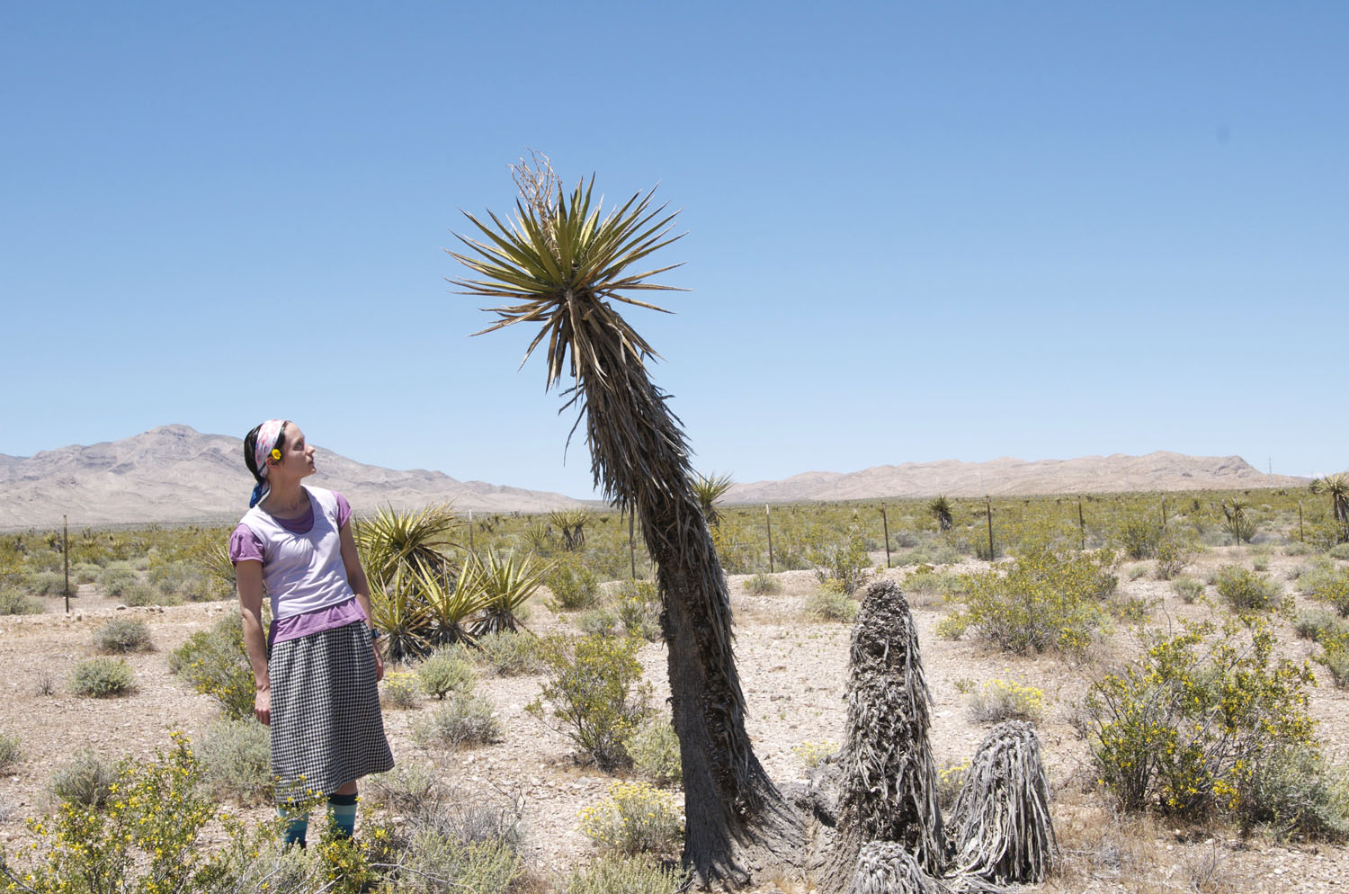
Journey to LA

At the great divide—with no one to kiss. The next lizard I find...
In Nevada, I stopped to pick flowers and befriend cacti.

Friday, May 7, 2010

I AM A WEAPON

The following is my official essay about how I, Tammy Lynn Shell, can impact graphic design. (Sadly, the necessary qualifier is, "sometimes")My writing process includes: brainstorming an entire day, about five pages worth, followed by, trying to pick the one word that is always on the tip of my tongue—waiting it out, smoking (not really), petting my dog, making tea—until that very certain word arrives, and the only one that could ever truly convey the specific meaning that I long to kindly thrust into the reader—otherwise unaware of the destruction and seduction (and love for assonance) within me.

Sunday, May 2, 2010

photo process for animation


original storyboard:original concept inspiration:revised concept map:

Monday, April 26, 2010

t4 type conference criticism

TypeConText, a demonstration of type-image seduction from tammy shell on Vimeo.

This is a poetic-persuasive animation for the MaberryShell imagined type conference about applying type and image in a meaningful and resonating manner.

I believe in type, image and narrative; rather than type, image and superficial flourish. (another potential conference title would be "Formalism Schmormalism.")

(A note for the curious: the boxer, Laura Frank, is paying homage to the beautiful and dangerous German feminist, Hannah Höch. Also, I, Tammy Lynn, did eat the raw meat.)

Friday, April 16, 2010

sparse site renderings

direction one,
direction two (my pick),
direction (super girly) three,

Thursday, April 15, 2010

if the hat fits

rendering options for my collection website:

Friday, April 9, 2010

TYPECONTEXT artifact list

TypeConText artifacts (todo list for MaberryShell):

website with messageboard
advertisements (print, billboard, animation)
flyer, brochure,mailer, postcard
name badge
signage
maps (of RISD campus, surroundings, local hotels)
e-mail reminders
wristbands
welcome package (including business card holder and warm cookie)

Monday, March 29, 2010

conference brainstorm

To facilitate interaction and exploration (and reduce the passive experience):

WORKSHOP (option)
– following a demo, groups are arranged, quick brainstorming sessions occur (under guidance) and the groups are unleashed for a time of making. (An opening subject may be: sending attendees out to the streets to find examples of type and image working—a fine embodiment of rhetoric on display. workshops may extend outside the room.)

KEYNOTE – one of the superstars might humble himself to serve as a moderator, rather than creating the traditional passivity-encouraging spectacle. The room would be divided up by topic and all would reconvene to share discoveries. The topic would specifically reference the speaker, who would be dangerously armed with wisdom for the discussion.

MIXERS – casual comfortable atmosphere for attendees to meet. Evening cocktail, Ice cream in the afternoon? music–To decrease the stiffness of a typical conference atmosphere, music will be added to mixer activities. (dance?)

WALKING GROUPS (with purpose) – Morning walking groups could meet at a local park. Since a huge walking/discussion group would be overwhelming, discussion leaders would be chosen upon arrival to park. Groups would break up concerning topic interest and experience meaningful conversation while meeting others with similar interests.

PANEL DISCUSSIONS – Lead by successful designers, professors, experts in the specific topic. Invitation and/or registration necessary for participation with some of these sessions to assure a wide range of disciplines within the discussion.

INTERACTIVE SCHEDULING – Invitation is mailed out with a survey of topics (beneath the postmodern, type and image umbrella) upon registering, the potential attendee would be given the power to partially determine the content of the conference. The practical purpose would be the ability to predict necessary space for specific activities, based on interest.

Thursday, March 25, 2010

TYPECONTEXT

Dustin and I have decided upon a title for our conference, TYPECONTEXT, based on our desire to create a conference focusing on concept over formal aesthetics. The advertising material would contain this simplified and persuasive description:

Why bother creating a message if it doesn’t carry a capacity to move the viewer? Seduce the audience by infusing the type & image with semiotics. Create resonating meaning by considering connotation of the surroundings.

pinups & pups

These photos will be applied to my furry product line, Good Dog Days (or Pretty Puppy something).
Taylor (above) has found her new career direction as a tamer of wild puppies; this is Nina, the lovable and destructive mastiff pup.
Azure is hopelessly smitten with the pretty Mandy.
When I happened upon this cement mix product line (on lovely package), I realized I needed to create a visual identity just as refined. Although pretty girls and cement mix may be an odd combo, who could possibly resist such gorgeous packaging? (Personally, I think the stereotypical excessively masculine, non-fashion minded, American construction worker would not be so moved; but the company is located in Greece, so who knows?)

pretty puppy something

My dog product is now titled either Good Dog Days, Pretty Puppy something or another revelation that happens in the next day or two. These are rough mockups—with fpo photos—I have decided to recruit the prettiest girls and dogs I know. Since my products would sell in a place like Anthropologie, I would imagine this display on a cute vintage dresser or cabinet:
Since my audience is somewhat environmentally concerned, I decided find and reuse vintage packaging (I plan to spray paint the lid, either black or red, at the very least). Also my target group would appreciate a handmade quality and likely shop at places like Etsy; I sewed handles on the product using handkerchiefs and pretty, patterned fabric. The smaller handle becomes a decorative cuff for the user; the larger handle becomes a scarf for the dog.

clean project brief (original & unedited)

Scenario: Stinky dogs are not an option.

Product Line: Good Dog, Bad Dog Days shampoo. The product contains only natural ingredients.

Target User: An environmentally conscious female dog owner, my target will be a young professional. She probably lives in a loft downtown. This product would be sold in an upscale store like Anthropologie.

Proposed Strategy: Fancy paper, sophisticated patterns and textures. My dog would be the model for all the advertising.

consumer:

comparables: (many are not especially attractive:)
visual research (aka, pretty inspiration):

Monday, March 22, 2010

type conference title possibilities

textcontext
typecontent
marinate with meaning
usurp your audience
usurp: to possess by force
by the ear
immerse
captivate, hypnotize, intoxicate
captivate intoxicate
create captivate
type seduction
pause receive
make them listen
meaning construct
cohesive collision

Why bother creating a message if it doesn’t carry a capacity to move the viewer? Unveil emotions through type and image. Seduce the audience by infusing with semiotics. Create resonating meaning by considering connotation of the surroundings.

Friday, March 19, 2010

Stefan Sagmeister, My Hero (new & improved)

(with an emphasis on adjectives and occasional glaze of alliteration)

Stefan Sagmeister (b.1962) grew up in a peaceful town surrounded by the snow-frosted Austrian Alps. Following high school, his studies centered around engineering. A swift change in focus occurred upon experiencing the seductive lure of graphic design while composing layouts for a liberal magazine; to create graphics for an anarchy issue, Sagmeister asked fellow students to lie on the playground in the shape of an “A”, while photographing them from a rooftop.

The potential possessed by design, enamored Sagmeister—although his first application to the Vienna University of Applied Arts was returned with a frigid stamp of rejection. Instead of wallowing in the depths, Sagmeister tightened his drawing skills, and received acceptance to the University upon a second attempt. His competence continued to bloom; following undergrad, Sagmeister received a Fulbright scholarship to study at the prestigious Pratt Institute in Brooklyn. While at Pratt, he dreamed of working for Tibor Kalman; peppering Kalman with phone calls proved beneficial as Sagmeister eventually acquired a job at M&Co.

Kalman encouraged Sagmeister to pursue his dreams and open a studio with only the addition of a designer and an intern. A studio of three, gave Sagmeister the freedom to pursue only the jobs he found engaging, including music graphics, AIGA lecture posters and self-indulgent, experimental projects. Even today, in spite of four Grammy nominations, Sagmeister continues to pursue only the jobs he finds engaging.

http://designmuseum.org/design/stefan-sagmeister

Tuesday, March 16, 2010

Owen Cox is oh so DADA

First of all, I am abusing the description modern dance (emphasis modern) to my advantage— at the moment, I am madly in love with Vignelli. As you will notice, this design is a Post Modern reaction to high Modernism with homage to my most favorite Dada. (by the way, my moto is always Dada, never Futurist.)
My new goal in life, besides fighting design pollution, is semiotics and simplicity; in the past, I would have acquired migraines with attempts to incorporate as many icons as possible, not to mention excessive ornamentation. Brad Cox, the composer of the Owen Cox Dance Group, is (like me) emotion, rather than logic driven and a fan of the esoteric; he did not want to divulge too much in the poster. He asked me to remove the press release and add only a poet description of the performance. (The performance combines Alice in Wonderland and the Lewis and Clark adventure within a wildly imaginative and non-linear narrative.) final design below.
The binoculars are an index of expedition. Frabjous, as a description of what will be encountered, is a reference to the combined word, fabulous and joyous, as spoken by the mad hatter. I tried to connote movement through the skewed perspective. The lines represent a sort of maze to symbolize the quest and non-linear story the dancers (and Brad's narration) will tell. Also, the word "expedition" is feeling antsy and ready to move on.

Friday, March 12, 2010

marinating type with meaning

A message maker longs, above all else to be understood. In an age when bombastic type and image surround us, it is not a simple task to entice and engage the viewer.

Often type is applied to image as an afterthought. A message infused with emotion, carries a higher capacity to flag attention. The goal of the message maker may be to inspire significant change or simply to cause the viewer to pause to raise a brow of acknowledgement.

My (more successful) type experiments were driven by a theme of unveiling emotions and opinions within a cohesive or purposefully conflicting context. A type conference possibility, would be one about the many ways to infuse meaning to type and image through the unleashing of narrative. Type and image driven by an emotional message can captivate, hypnotize, intoxicate and most importantly (through redundancy) to grab the unwilling viewer by the ear and make them listen.

Tuesday, March 9, 2010

based on a true story

Nina has limitless love for everyone she meets. She's a giant nine-month old, lab-mastiff mix, who happens to be a lap dog. Her eyes are always full of wonder, especially when she's bouncing around like a deer in the backyard.

But sweet Nina has one minor flaw; separation anxiety causes her mouth to destroy everything in sight. Leaving her alone five minutes in my room, means I may find half my slipper on the bed. My friend’s puppy is serving as inspiration for the brand identity project.

soft and paper sculpture inspiration

Art direction and costume design by KCAI alumni, Andy Byers ('03 ceramics)

Monday, March 8, 2010

Monday, March 1, 2010

idea projections

The most powerful discovery I’ve experienced from my type experiments is, a powerful message in the wrong environment loses impact and a message with only surface level meaning, even when placed in a fitting environment, cannot hope to achieve more than a one-liner status.

the projections below, make sense only as a set.