


 hey, that's my shoe.


 other side

 website mainpage
 invoice front
 invoice back (the pad with make ready and screen printed collage, hammerpress + tammypress)
 We never said we were dirt cheap.
 the menu cover (made from old book cover elements + screen printed collage elements)
 (my inner cameron perry may have taken over for this one)
 never crop a hand like this

 stationary
 invoices to thank the masses for eating dirt.
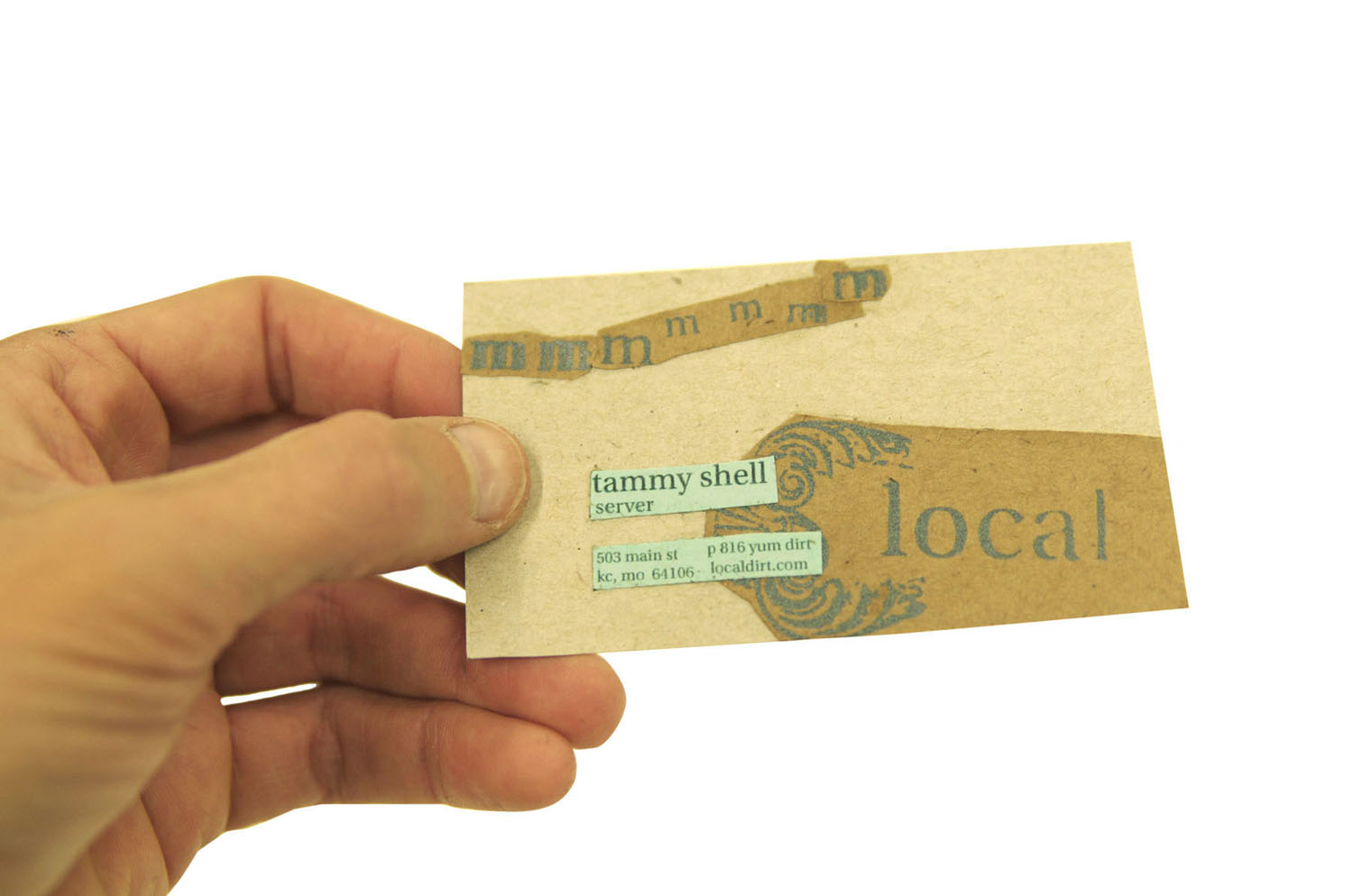
 business cards
 a necessary #10 envelope (because we might be dirty,
 the dirt vehicle
 environmental signage


 I long to create something that is absolutely anti-iconic. To me, iconic design is equivalent to the expected. (Why bother creating a message if the result is something the masses already know?)


 my kitchen (above) and an expressive type demonstration (below)


 You don't have to say it, I have already been reprimanded. I just enjoy the type escaping to the heavens. (above) Key beliefs include a commitment to acquiring ingredients from local and organic markets.
 The only required commonality for those who enter this restaurant would be, an affinity for flavor.
 The above photo (taken at Bad Seed) symbolizes the unending possibilities.
 The essence (as symbolized by a fragrant aroma) would be tasty and healthy vegan food.
 Brand attributes: friendly, organic and eclectic chic. (It is my desire for the style of these slides to embody this theme.)

 (A cameo from Brooke Salvaggio who grew up with the nickname, Bad Seed. (What a perfect name for her farmer's market.)

 Flavor skeptics are our favorite to please. (Does his face not say it all?)
 We're in your neighborhood...so stop on by. (A goal of this restaurant will be to establish a diverse and inviting community.)
 Convinced?


