Sunday, March 20, 2011

WE! program partial


This is a (take one) partial of the program interior. Grid-ish seems to be my theme. I begin with such good intentions...On another note, Jamie Gray better come to this.

Saturday, March 19, 2011

chromatic collaborations / take one


final poster above with sparkling chromatic font; fpo posters below...

Tuesday, March 15, 2011

hi there chicago

Mikal is a musician from Kansas City who is studying film at SAIC. (She is also friends with everyone in the whole world and the reason I once got to eat lunch with the amazing Eleni Mandell.)

Thursday, March 3, 2011

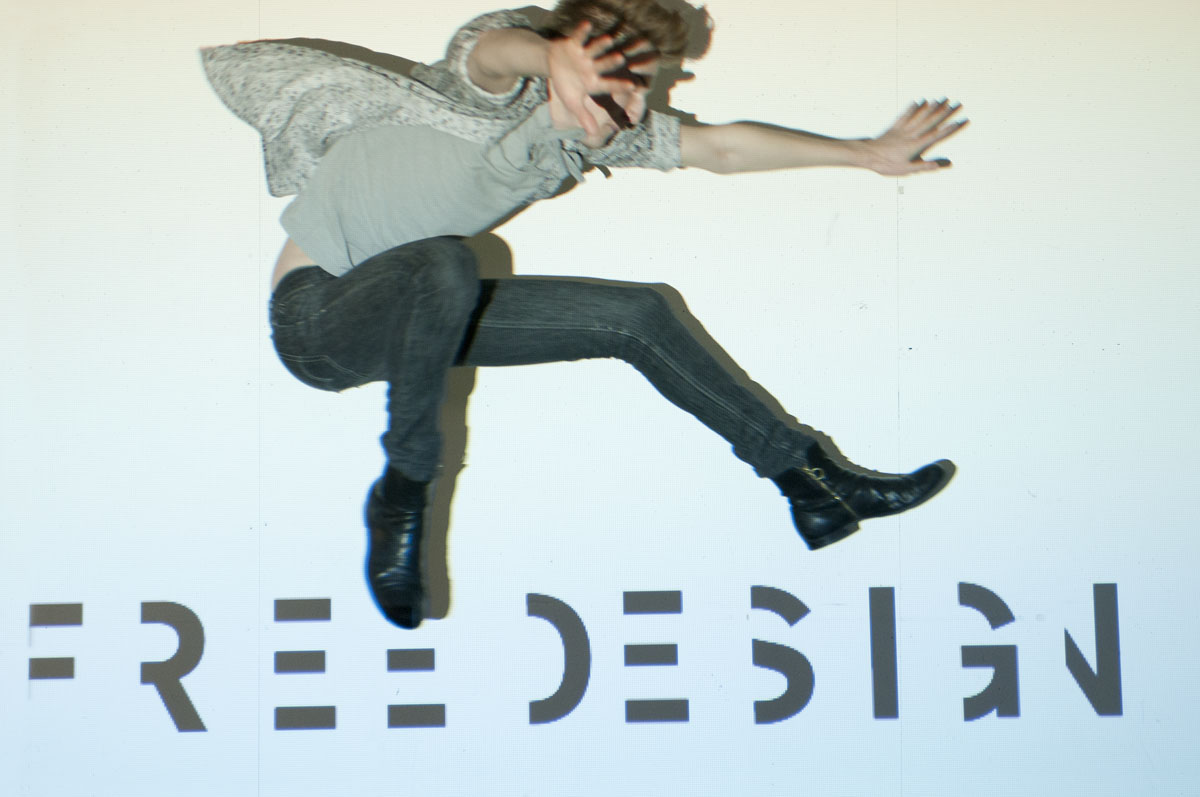
FREE DESIGN

MaberryShell have teamed up once again and boy are we having fun.

The original essence of FREE DESIGN is free-spirited design. The freedom part can be broken down into the following (initially cryptic) categories: joy, individuality and impact.

1. It's all about JOY.
If we are not designing from a spirit of joy, then what are we doing here? It's easy to tell from our work that passion is the driving force. Our goals are not simply to create pretty things, but to marry beauty, passion and function.

2. We are free to be individual.
Upon entering the design department at KCAI we do not have to check our individual talents and propensities at the door. We are not shoved into a confining mold, but are allowed the freedom to grow and manifest our individual design directions. (The video, at the bottom of this post, is a symbolic and in-process representation of this. Thank you Brian for the comic relief.)

3. We are freeing design from the confines of the computers.
We are taking design out of the computers and applying it to impact the world. Our experience with Rosedale was an amazing example of this. We are learning to consider the power we have as designers. (Within this department, I have not just grown as a designer, but a person.) And lastly, (as Kate and Carly mentioned in their presentation,) With great power, comes great responsibility.

In my opinion, the opposite of free spirited design is "stiff and really dry design."

Dustin and I took running leaps up over this projected text, ahhh experimental type. We only slammed into the wall and fell rolling on the ground a few times...so very worth it.
possible catalog cover:
web page: (all of these would include photos of the entire leaping senior class)

Monday, February 28, 2011

experience as teacher

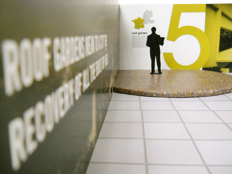
The Modern Transition exhibition is a total sensory experience for the viewer. Our emphasis has been placed on Le Corbusier's journey as equally important to his arrival to each of the Five Points of Architecture. As the viewer takes the journey from room to room, he or she will experience a taste of sights and sounds of Le Corbusier’s expedition. The marriage of the literal with the poetic is key within our theme. We long to pursuade the viewer of the importance of the Five points through a thorough steeping into the driving passions of Le Corbusier. Corbusier’s primary influences will be married to his point of view. The music and visuals will mesmerize to dislocate the viewer from the current moment and slice open a portal into Corbusier’s world.


Thursday, February 17, 2011

destiny vinely

Destiny teaches aerial classes at the Quixotic studio.

Tuesday, February 15, 2011

becky buznedo

amy farrand

This is Thomas, Amy's ultra attention-needy cat. Whenever he was not posing in a photo with Amy, he was in my lap. I tried to pack him in my bag.

Monday, February 14, 2011

pricing & ethical guidelines

So far in my freelance pursuits, I have worked with solely non-profits. This is partially because I enjoy pursuing work with performance groups. I feel like some guidelines within this book don't quite apply to me just yet. My design reputation is still in the works, and so I don't feel I can charge a very decent amount. In the end, all pricing is subjective and a decision between the artist and the client.

"Artists need to be clear on the various components they will work on," as stated in the handbook. I appreciate the breakdown of five possible rolls of the graphic designer within a given project: orientation, design ideas, design execution, production and on-press. (Who knew it was possible to bill for each?) Honestly, when considering a printed project, I thoroughly enjoy all aspects, including the press-check. My experience at a printing company has instilled realistic as well as high expectations for the final product.

I had never considered asking the client to sign a contract—even a casual one. The confusion of what is expected by the artist could be made explicitly clear—if, of course the tight project specifications are known by the client him or herself at the beginning. Deciphering through the haze of a cloudy project can be frustrating.

Another bit of wisdom as gleaned from this book is, educating the client about the roll of a graphic designer, is the designers job. For instance, the client may choose the safe solution out of habit. The designer's roll is to attempt to steer the client from the idea of comfort to the most powerful solution. We are problem solvers, rather than pretty (non functional) thing makers.

Saturday, February 12, 2011

Thursday, February 10, 2011

WE! take one

before shredding the stage:
after shredding the stage!!!!!!!!!!:
The shredding action is hot off the press—and it has a photocopy feel. The project WE! will shred the concept of the traditional stage as well as the suffocating context of the office space. The main audience for this event will be art appreciating professionals. I am thinking happenings, bauhaus, deconstructivism. The context is the 6th floor of an office space. I imagine Jane Gotch standing on the window ledge with a decided aversion to setting a foot the floor.

Another photo possibility would be Mark Southerland holding a sledge hammer about to smash into a wall—because they are breaking down walls both figuratively and literally for this audience participatory performance.

So why not a poster series?

Additionally, I am not always a fan of the icon approach (literal representation of the person) BUT, Jane (and Mark as well) emit a powerful aroma of ethos. Dangerous soul penetrating actors, they are.

meat joy

Motion is beckoning my attention and I am smitten. My heart flutters concerning the conception, recording and editing processes. (This digital filmmaking class is going to change my life.)

Music: Hot Boyz, by Casiotone for the Painfully Alone (with Dear Nora)

This is a reaction to the linguistic experiments of the exploratory and portapak embracing videographer, Gary Hill. Specifically his piece from 1984, Why Do Things Get in a Muddle, Come on Petunia.

Tuesday, February 8, 2011

testing the portrait

My process is partially inspired by the writings of Annie Leibovitz, as I am currently sifting through a book titled, Annie Leibovitz at Work. So far I have realized, no matter how gloriously talented a photographer may be, a portrait that truly defines the subject is no swift journey. During one of her commissioned portrait campaigns, she devoted an entire day to interviewing and researching each subject. She is of the persuasion that solely reading about the person is not enough. A one on one exchange is much more effective if truth is the pursuit.
With Annie on the brain, I met up with Taylor at her house. (I recently purchased a set of strobes, so I am officially mobile!) When she opened the door, a pretty and especially clumsy puppy attempted to give me a hug—I knew I was in the right place. This project is sort of an invasion into the lives of people, some I only know from afar.

As we sat down at her table, I grabbed my detective hat as well as a pen and paper. Vintage details everywhere—I had a hunch. My inner Sophie Calle peaked out. Should I walk around photographing objects that I find interesting and ask for a story? Should I ask her to leave the room while I take a gander and determine a possible narrative? First things first, this is the just the facts ma'am part of the project, and my word, and I would like to create a (loose definition) traditional portrait.

Taylor began explaining how she has a hard time throwing anything away. And sentimental she is, her apartment contains many inherited items from her grandmother and great grandmother. Even Taylor's cat, Calle, belonged to her grandmother. Her world revolves around family. Upon the completion of the casual interview, I waited. Surely it would happen. The sign. The one that flashes with (almost all) working bulbs with the arrow pointing towards which path to pursue. (This is beginning to become a little verbose and so I will stop now...thank you for listening.)
For this portrait study, I plan to put into practice what I have (and will) glean from studying the masters. (Those that I consider masters are defined in previous posts.) I will bathe in their processes and emerge anew. My personal goal is to collaborate with the subject and allow the processes I have learned thus far from graphic design to merge with the tests.