Tuesday, September 28, 2010

Sunday, September 26, 2010

Wednesday, September 22, 2010

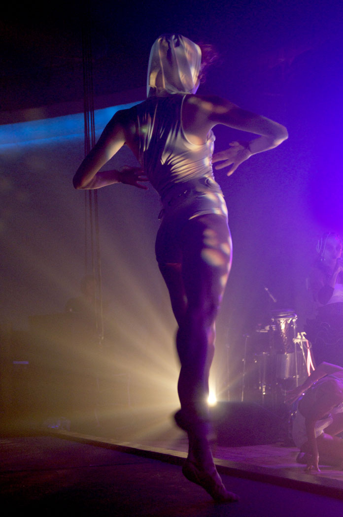
Hypnotic

Dance initiated intoxication struck the crowd, last Friday at the Granada. Those who are new to the Quixotic experience may be easily identified by the occasional gasping and gaping mouths.

Additionally, this performance equated a pilotes session for my photo skills—not just because this particular venue does not believe in the necessity of air conditioning.

My process includes clenching the camera to my body as tightly as possible. I do not breathe until I have released the shutter. (The luxury of breathing freely in combination with a slow shutter setting and fast moving objects means a missed shot and a purposeless existence.)

Tuesday, September 21, 2010

come on, jump already

The final (and finally, nearly off to press) design for The People's Liberation Big Band, which I began quite a while ago. It all started with a brainstorm of the blatant, qualifying descriptive word.

After giving Brad Cox a short list of possibilities, he quickly chose the flying machine idea. My original design has been given a facelift of background image and free spirited dada inspired type. And obviously, I was thinking about cute hair when I drew this.

The cd release party will occur in November...not to be missed, I tell you.

Reappropriated smoking ad

Why yes it is, and thank you for asking.

My response to a casual question from a friend, "is graphic design fun?" Graphic design is a ridiculously wonderful challenge of systems, purpose and technique, teaching an aversion to pretty for the sake of pretty (which I admit, may be my specialty.) I am learning to have a strong purpose for any design work or else suffer the one-liner consequence.

Monday, September 20, 2010

Local Dirt

Last night the lord spoke...Local Dirt = Local YUM

I adore the initial imagery of munching on dirt. (Sorry to speak the obvious)—the dirt is actually an indexical reference to acquiring food by means of local gardening. But we will serve dirt as well, if you desire.
I long to create something that is absolutely anti-iconic. To me, iconic design is equivalent to the expected. (Why bother creating a message if the result is something the masses already know?)

Alright so not everyone will grab a bite to eat at a place called, "Local Dirt," but that is alright with me. (My alternate brand idea is yum (with as many "m's" as are needed to establish the echoing euphoria.)

Sunday, September 19, 2010

What's in a name?

Problem Statement (concerning the identity specs of my new vegan restaurant):

The goal of this visual identity will be to convey the idea that vegan food can be surprisingly and explosively tasty. The tone of voice will be caring and optimistic. The attributes to be embodied will be friendly, organic and eclectic chic. The needs fulfilled will be healthy and flavorful food located in an inviting and non judgmental community.

and now for a few name possibilities...

Proponents of Yum

About five years ago at an art show, I met Heidi Van Pelt, the infamous creator of the local vegan restaurant, füd. Throughout the show, she was serving ice cream made from cashews; the flavor was incredible. I had no idea this was possible.

The following is a collection of slides from my recently flavorful presentation concerning a branding idea for an explosively tasty vegan restaurant.

(I began this project while attempting to carry out a not only vegan, but solely raw diet. Three weeks later—and ten pounds lighter, I am now a just a vegetarian.)
my kitchen (above) and an expressive type demonstration (below)
You don't have to say it, I have already been reprimanded. I just enjoy the type escaping to the heavens. (above) Key beliefs include a commitment to acquiring ingredients from local and organic markets.
The only required commonality for those who enter this restaurant would be, an affinity for flavor.
The above photo (taken at Bad Seed) symbolizes the unending possibilities.
The essence (as symbolized by a fragrant aroma) would be tasty and healthy vegan food.
Brand attributes: friendly, organic and eclectic chic. (It is my desire for the style of these slides to embody this theme.)
(A cameo from Brooke Salvaggio who grew up with the nickname, Bad Seed. (What a perfect name for her farmer's market.)Flavor skeptics are our favorite to please. (Does his face not say it all?)
We're in your neighborhood...so stop on by. (A goal of this restaurant will be to establish a diverse and inviting community.)
Convinced?

Tuesday, September 14, 2010

can you dig it?

Garrett Fuselier appeared for our very first community poster crit and left us (Lance and me) with quite a bit to consider. The ever smiling and energetic Garrett overflowed with passion for a specific line within the individual poster under the topic of those who BELONG:

The [urban gardening] individual will be identified by the remnants of dirt on his or her knees and hands.

This line especially incapsulates the gardening personas Lance and I have been exposed to. For instance, Lydia (the amateur gardener identified within the poster) works in the garden almost every day. I happen to live with this gardening individual and am inspired by how at ease she is with dirt lingering on her hands, knees and bare feet. (There is something endearing about it all.)

Our front yard has been converted to a garden of various herbs, flowers and vegetables. The empty lot a few houses away gave her a fine opportunity to initiate a guerilla garden of watermelons, squash, various lettuce plants and other lovely vegetables. For Lydia, gardening is not an activity, but a lifestyle.
The vector text of the original poster for urban gardening (above) seemed especially lackluster. And a more texture-centered approach seems to better encapsulate the hands on approach of the activity...not to mention, the love.